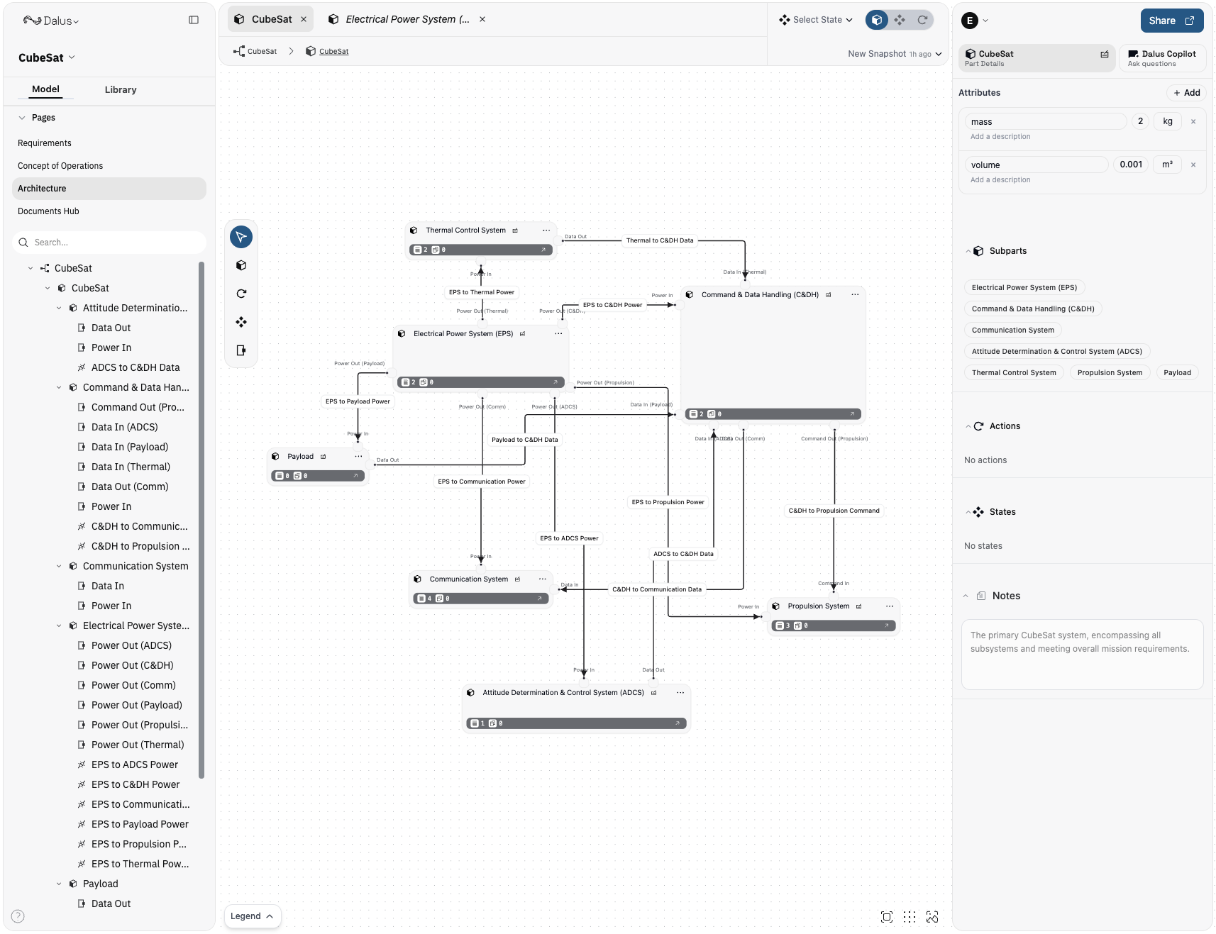
Architecture Re-design
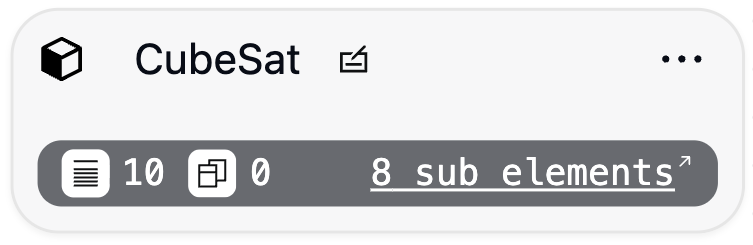
Refined node styling for improved readability and contrast. Interactions and behavior remain unchanged. Added hyperlinked badges in the Sub parts, actions, and states sections for better navigation.
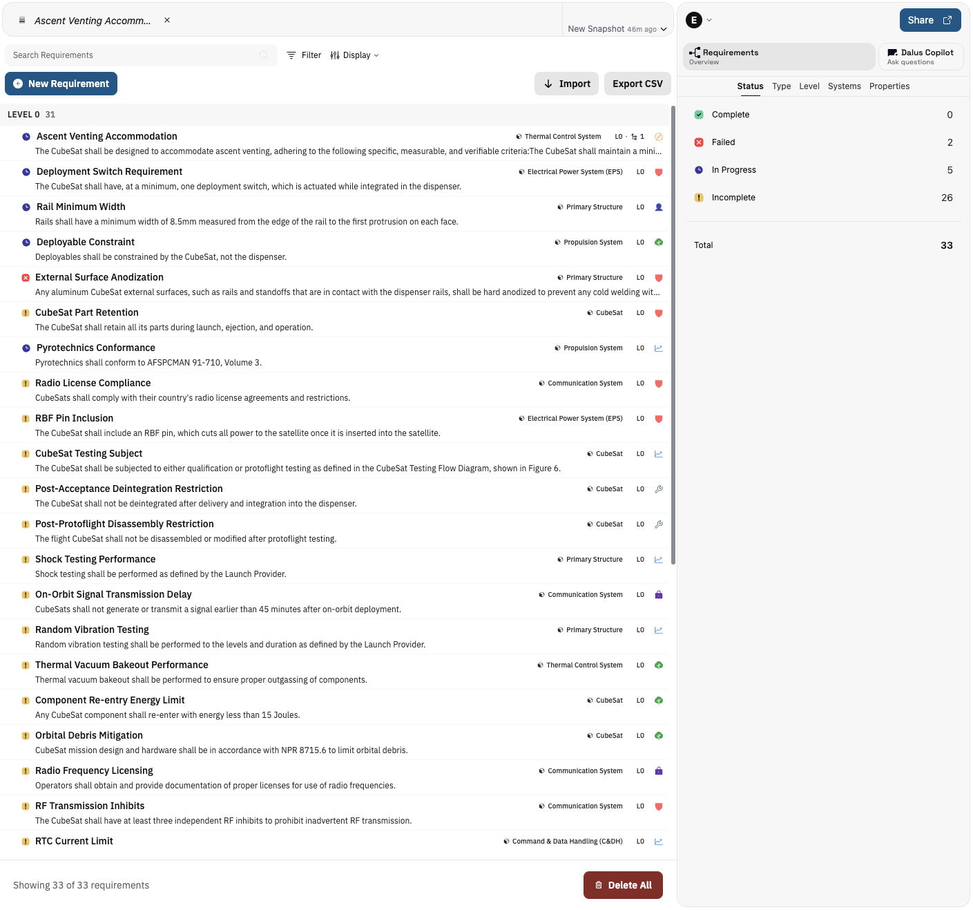
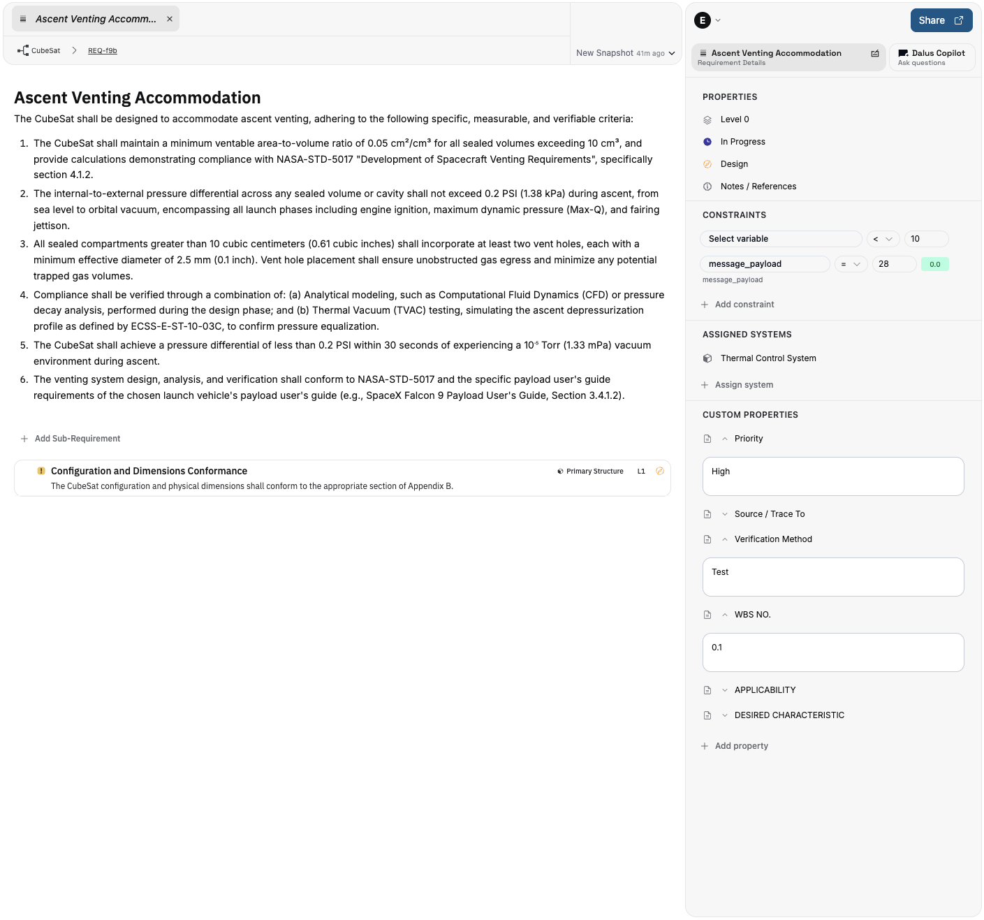
Requirements editor
High‑traffic editing surfaces are cleaner and more powerful.
How to use it:
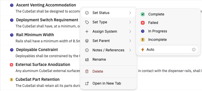
- Requirements page uses compact requirement “pills” for dense, scannable lists
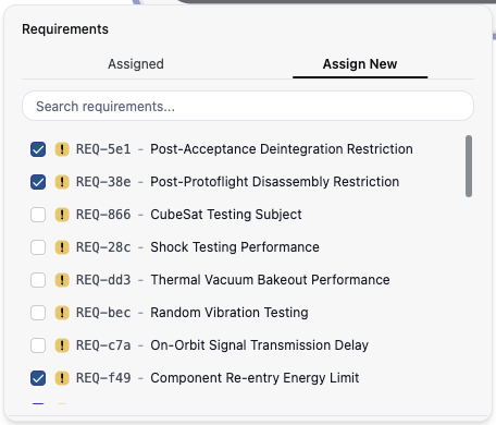
- Click a requirement to open details; use the new context menu for setting requirement Status, Type, Parent, and more
- From the Left Sidebar requirements tree, double-click an item to scroll the view to it
- Open Display Options to sort by field and choose compact layout
NEW Requirement Tabs / Internal view
Requirements now each have their own page to support a main editor for long-form content. All existing properties remain in the right sidebar or can be accessed through the context menu on the root requirements page.
- Main editor uses clearer typography and spacing for long‑form content
- Right Sidebar groups properties, constraints, and system assignments for quicker scanning
Navigation Improvements
We introduced temporary tabs (shown in italics) to keep your workspace tidy as you move around. Double‑click a temporary tab to make it permanent, or open a permanent tab directly from requirement and node context menus.

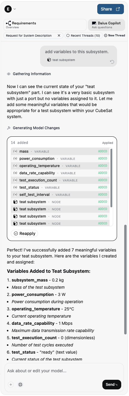
Copilot redesign
A cleaner layout with improved context visibility and streamlined actions.
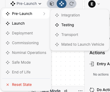
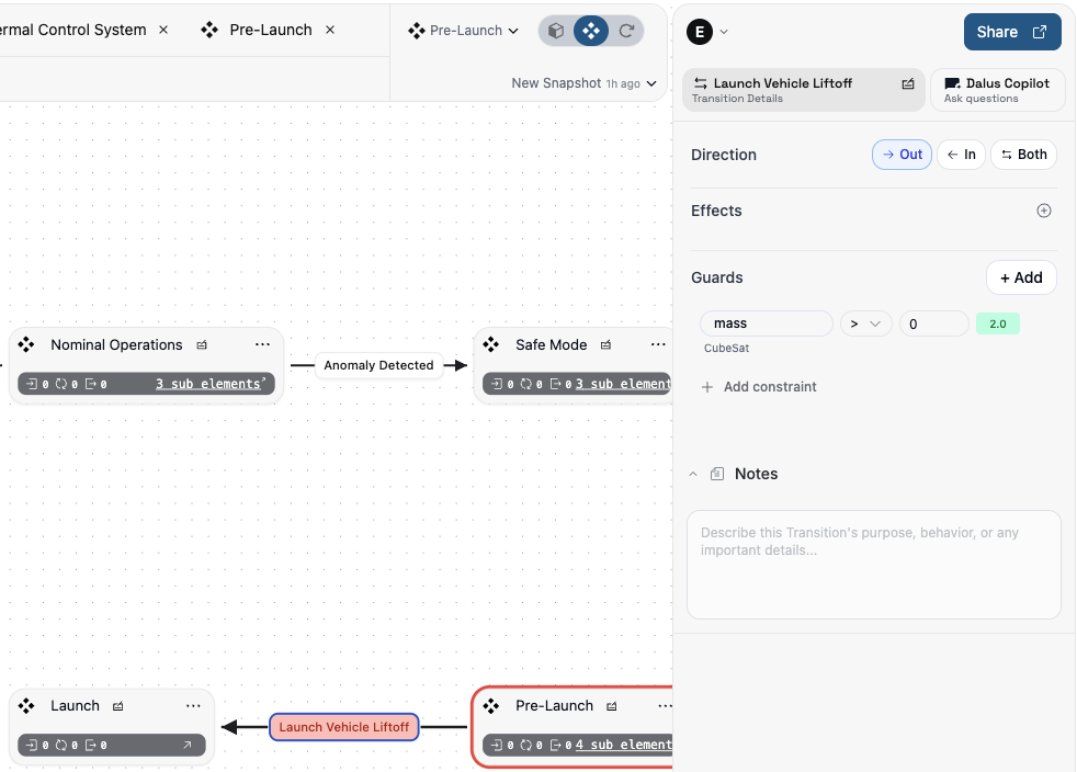
Richer state modeling: Substates and transition guards
Model hierarchical behavior with substates and add guard conditions to transitions for precise control.
How to use it:
- In the TabHeader > State Dropdown, transition to a state containing substates. You will see additional options to transition to substates
- In Right Sidebar > Transition, define guard conditions for transitions by selecting a variable, operator, and limit. Blocked transitions are highlighted in red.
Improvements
- Toast confirmation after creating a requirement
- More consistent spacing and typography across workspace pages and sidebars
- Copilot adds variable units more reliably
- Disable browser auto‑fill on inputs to avoid accidental values
- Team pages access and member management reliability improvements
- Constraint editor shows parent element name for context
- Copilot model upgrade for better responses
Fixes
- Requirement imports via CSV/Excel no longer duplicates existing custom fields
- Snapshot input focuses correctly when adding a snapshot
- Variable search ID copy fix for connections
- PDF preview timeout reduced for more reliable document viewing
- Port‑to‑Port connections rendering bug fixed
- Resize Action node on resize fix
- Immediate UI loading feedback when opening models
- Copilot thread naming fix